In what ways does your media product use, develop or challenge forms and conventions of real media products? (i.e of music magazines)


Looking at my magazine compared to a real one really let's you see how similar they actually are and it also helps to pick out the differences. First thing to look at would be the masthead. On the real 'Rolling Stone' magazine the masthead clearly goes across the top of the page which is the most common way to do a masthead as it makes it the most important piece of information on the page. It is layered over the image and has got a 3D font and is in a musty yellow colour which doesn't really represent what the magazine is most probably about. However as you see my masthead challenges the norm of having it across the top page. Instead I chose to have it just half way as I wanted to have the main focus to be on the name of the artist. I tried to pick a font that would also represent folk or atleast give of the right vibe so that is why I chose quite an old english style to give off the right effect.


The graphology of the contents page is the main aspect I worked on most to follow the conventions of other contents pages of music magazines I have seen during my research. Looking at both contents pages shows how similar they are. Mine uses a similar sort of layout at the real magazine contents page. My magazine clearly shows an 'F model' with the column on the left hand side and the column in the middle. Similarly the 'Rolling Stone' magazine uses a similar layout with the column down the left hand side and with a piece of writing across the bottom. Both magazines have the name of the magazine shown to let you know it's all part of the same one. I used the masthead whereas the other shortened it to 'RS.'
To represent the genre of my magazine I tried to pick the right props and costume to portray the right image. As you can see on my front cover I have got my model in quite a creased shirt with just a plain black top underneath. The creased shirt, beard and chest hair gives off a rugged sort of folk festival look which is what I was aiming for. Also on the contents page I have got the same model sat on the floor with an acoustic guitar and a melodeon, both which are popular within the folk community so I thought they'd be good to use.
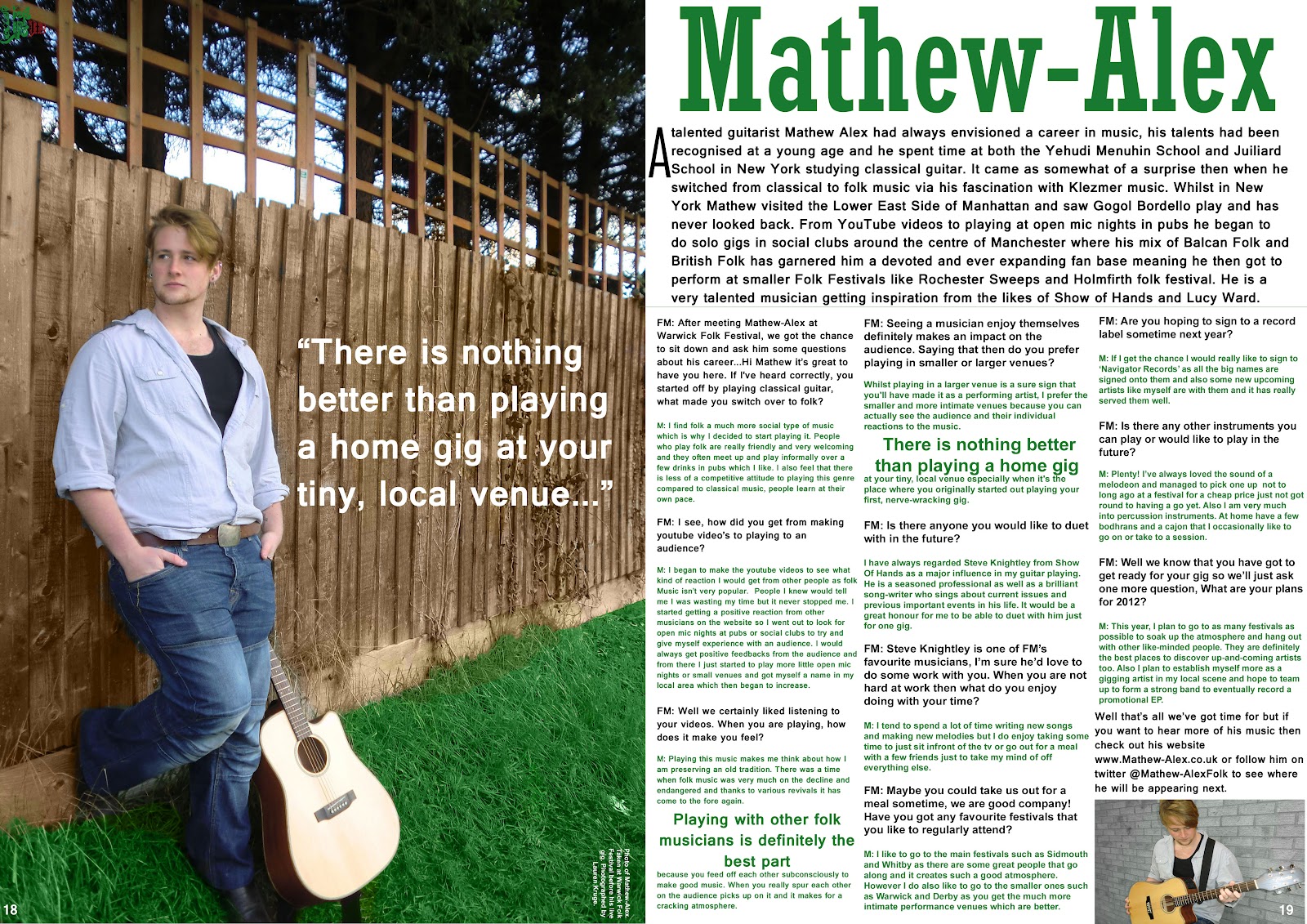
I tried to get a variety of different camera angles throughout my magazine. My front cover uses a mid-shot of my model which is the usual angle to use on a front cover as it wants to be eye-catching and be clear to see if it was on a shop shelf. My contents page uses a variety of mid shots and long shots which again is the usual thing to do on a contents page as you want to keep it looking interesting. As you can see above on my double page spread I use a long shot photo so that you can see the guitar clearly and get a good size patch of grass to get the greeness.
I tried to fit a variety of different fonts in my magazine to keep it looking interesting. On the front cover I used a very old style english font to represent folk and to fit with the genre. I used that font throughout but only on the name of the magazine on each of the pages. I then use another 2 different fonts on the front cover to keep it from looking boring. On the contents page I use a new font for the title and the little sub headings and then another font for the page information. Again on my contents page I use a new style font for the artists name and another for the article. I used a nice, clear font for the article to make it easy to rea
I used a variety of different techniques to make sure the folk genre was being shown throughout the magazine. For the masthead like i've said before I chose an old style font to fit with the stereotypical folk look. For the front cover photo I had my model looking quite rugged to give off the festival style and to fit in with the typical folk lad. On the contents page I used a collection of photo's to fit with the folk genre and show it off. I have a model holding up a Guiness Bodhran over their face, as picture of a morris dancing team and then my front cover model with an acoustic guitar and a melodeon. All photo's connect well with the genre of folk as they all play a big part in it. Finally on my DPS I have a long shot photo of my model with his guitar in a field which is supposed to represent being at a festival or maybe just a photoshoot for an album cover. The colour scheme I chosen also I think fits very well with the representation of Folk. Throughout the magazine I used a range of greens, white and black. Green is the main colour focus I wanted to have throughout the magazine as most people stereotypically put the colour green and folk together.
You make a series of correct points but there needs to be more of them for your cover and contents pages. Try to also use the vocabulary from the question to better demonstrate your focus on the question.
ReplyDelete