To the Examiner,
I hope you enjoy looking through the work I have produced over the past few months as I have spent many hours to try and make it the best I can. I spent a lot of time on research, planning and practicing my skills on the software programs that were introduced to me so I hope you can notice this when looking through my posts.
I feel my skills have improved immensely throughout this process and I hope that it shows when you look at my front cover, contents and double page spread.
Hope you enjoy
Thank You
Thursday 29 March 2012
Evaluation Question 6...
What have you learnt about technologies from the process of constructing this product?
Make a video of your own at Animoto.
Computer/ laptop - majority of work was produced on the school computers during lesson time or after if they were available as it meant i was able to access photoshop easily.
Photoshop - Where i was able to produce my product and edit it easily with the tools on the programme to allow me to make the desired affects on my magazine. Before taking media i'd never used photo shop before but with having a quick tutorial in the preliminary task, I soon became familiar with it and was able to make the product that i wanted. At the start i was constantly having to ask my classmates for help as i found photoshop very difficult to navigate round but nearer the end of the task i was at a similar standard to everyone else and was managing to use the programme with ease.
Digital Camara - This is the camara that I used to take all of my photo's with for my magazine. It isn't the highest quality but it managed to produce some good photographs which I then went and used in my magazine. By taking practice photos helped me develop skills with the zoom and how to position the camara to get the desired image.
Microsoft Word - I used this to write up my double page spread article/interview. This seemed the best place to write it up as it meant i would be able to keep an eye on the word count and also begin to structure it in some way.
Scribd - This is a website where you can upload word documents and embed them onto your blog. I used this to upload the drafts of my magazine and some analyzing work that i had done.
Flickr - This is a website where you can upload photo's onto it for people to see and then create a photostream slideshow which can then be embedded onto your blog. I used this to show my practice photo shots. I had never used this programme before but it was very easy to use and i managed to do what i wanted on it without any problems.
Animoto - I used animoto to create a short video of my 25 word pitch so that people would get a quick glimpse of what was expected to be in my magazine and what the genre was going to be.
Memory stick - I used this to tranfer documents and photo's over different computers so that i was able to use them on different pieces of software.
Internet - Google.com played a vital part in the research and planning for my magazine. It allowed me to find magazine exemplars and examples of articles/interviews which then gave me a better idea of how to structure my own. I learnt how to research certain areas of my magazine and found many websites to help me do so. Doing more and more research made me quicker at finding answers of the internet.
Evaluation question 5...
How did you attract or address your audience?
 My magazine aims mainly at teenagers of a student age but can still fit well with younger adults. I have tried to design my magazine in the way that will attract them the most. It's not aimed at a specific gender as folk music is equally enjoyed by woman as it is men so I have tried to balance out the contents inside to try and match both genders. The cover lines on my front cover have a couple of male artists and a female artist. I chose to have these artists as I think they fit well with both genders as they are enjoyed by most. All the artists are British artists playing English folk music. This should again appeal more to people as it means that inside the magazine they will be able to find out where certain acts are performing and will be able to follow their progress throughout the year. One of my cover lines is about winning tickets to Whitby Folk Festival, I think this appeals greatly to my target audience as it is the most popular festival and students/young adults can sometimes find it too expensive so having the chance to win them would entice them.
 My contents page is also aimed at my target audience as I have kept it pretty simple with short sections of writing which they will be able to understand as it's not particularly formal. The pictures I have chosen I think will work well with my target audience as they all relate to the genre. At the bottom we have an upcoming artist sat with his instruments looking very casual. In the middle we have an advertisement for Whitby Folk Festival and at the top we have a picture of 3 of the ladies from Mutineers Morris dancing team holding mugs of beers with big smiles on their faces. All these things relate to Folk and young Folkies would enjoy to see as it will want to make them read on. I think the artists I have used in my reviews and features will appeal to my target audience as they are all very well known artists that most young musicians aspire to be like so reading exclusive interviews are very interesting. I think by having the little subheadings on the pages makes a lot easier to navigate straight to the page the reader wants which would also attract the audience as it saves time which students like.

In my interview I have kept the voice of the artist sounding youthful which will relate better to the young reader. The photo I chose would also attract my target audience as it is the style that is used on many album covers of big artist such as Andy Cutting and Julian Sutton. With it being in a field it makes Folk artists think of festivals and camping. Having the quote from the artist 'There is nothing better than playing a home gig at your tiny, local venue...' I think will attract the reader as I feel they would see this and want to read about the situation he is talking about in the interview. The interview is completely just about music which is a very good aspect as some magazines will go off onto fashion or other subjects that are totally irrelevant. Having it purely on music will attract the audience because then they are getting exactly what they paid for.
Overall I think I have met the requirements well to attract my audience. I focused a lot on my audience profile to make sure I was on the right track of making it seem like a believable magazine.

 My contents page is also aimed at my target audience as I have kept it pretty simple with short sections of writing which they will be able to understand as it's not particularly formal. The pictures I have chosen I think will work well with my target audience as they all relate to the genre. At the bottom we have an upcoming artist sat with his instruments looking very casual. In the middle we have an advertisement for Whitby Folk Festival and at the top we have a picture of 3 of the ladies from Mutineers Morris dancing team holding mugs of beers with big smiles on their faces. All these things relate to Folk and young Folkies would enjoy to see as it will want to make them read on. I think the artists I have used in my reviews and features will appeal to my target audience as they are all very well known artists that most young musicians aspire to be like so reading exclusive interviews are very interesting. I think by having the little subheadings on the pages makes a lot easier to navigate straight to the page the reader wants which would also attract the audience as it saves time which students like.
In my interview I have kept the voice of the artist sounding youthful which will relate better to the young reader. The photo I chose would also attract my target audience as it is the style that is used on many album covers of big artist such as Andy Cutting and Julian Sutton. With it being in a field it makes Folk artists think of festivals and camping. Having the quote from the artist 'There is nothing better than playing a home gig at your tiny, local venue...' I think will attract the reader as I feel they would see this and want to read about the situation he is talking about in the interview. The interview is completely just about music which is a very good aspect as some magazines will go off onto fashion or other subjects that are totally irrelevant. Having it purely on music will attract the audience because then they are getting exactly what they paid for.
Overall I think I have met the requirements well to attract my audience. I focused a lot on my audience profile to make sure I was on the right track of making it seem like a believable magazine.

Evaluation Question 2...


How does your media product represent a particular social group?
The social group that I am hoping to aim my magazine at are generally known as 'Folkies.' I have designed my magazine in the way that I think would attract this certain group. When people hear the word 'Folk' they tend to just imagine old men with beards drinking beer with bells around their ankles and waving hankies about. I want to try and get rid of that stereotype by creating this magazine which is aimed at the younger generation of Folkies in hope that other young adults may find it appealing. The style of my magazine is similar to magazines such as RollingStone and Spex. They aren't necessarily the same genre as my magazine but they both use similar photos and the same sort of layout. The colours I used on my front cover and throughout my magazine represent the genre well as most people associate folk with the colour green. I chose my cover artist as I think he has the 'Folk look' about him. He's not clean shaven with nice gelled hair and smart clothes. Instead he's got facial hair, fairly messed up hair and a creased shirt on which I think reflects the genre well as folk musicians don't tend to bother about their appearance too much. Also I chose the photo where he isn't looking at the camara which is usually a good technique to use as it draws the reader in however folk music isn't about drawing people in, they don't go out of their way to get noticed, it is all very laid back. Folk artists mainly just play the music they enjoy and hope that others will enjoy it with them. They don't choose to go out of their comfort zone to get more followers.

My contents page represents my social group mainly because of the colour scheme I have used and the props in the photos along with the models I chose in the photos. The writting is simple and to the point and the photos still focus on the music aspect with the instruments on show linking to the folk genre and the morris dancers in the top photo. A couple of the dancers may be slightly older than the age group I am aiming for but folk people look past the age and just see them as performers or musicians. Also as you can see in the photo they have great big smiles and are holding up their mugs full of beer which is a very common aspect of the Morris tradition. Again i've kept with the same colour scheme as on the front cover as green is the best way to promote a folk based magazine.


My double page spread definitely represents a folk social group I think mainly because of the colours and photo used. I think that because the artist would actually fit into the target audience, he represents the social group perfectly. I wanted to keep the interview very informal and relaxed in the way that the representative social group would act and speak so that they could relate to it a lot easier.


Wednesday 21 March 2012
Evaluation Question 6 Practice...
What have you learnt about technologies from the process of constructing this product?
Computer/ laptop - majority of work was produced on the school computers during lesson time or after if they were available as it meant i was able to access photoshop easily.
Photoshop - Where i was able to produce my product and edit it easily with the tools on the programme to allow me to make the desired affects on my magazine. Before taking media i'd never used photo shop before but with having a quick tutorial in the preliminary task, I soon became familiar with it and was able to make the product that i wanted.
Digital Camara (dont know the make at this time) - This is the camara that I used to take all of my photo's with for my magazine. It isn't the highest quality but it managed to produce some good photographs which I then went and used in my magazine.
Microsoft Word - I used this to write up my double page spread article/interview. This seemed the best place to write it up as it meant i would be able to keep an eye on the word count and also begin to structure it in some way.
Scribd - This is a website where you can upload word documents and embed them onto your blog. I used this to upload the drafts of my magazine and some analyzing work that i had done.
Flickr - This is a website where you can upload photo's onto it for people to see and then create a photostream slideshow which can then be embedded onto your blog. I used this to show my practice photo shots.
Animoto - I used animoto to create a short video of my 25 word pitch so that people would get a quick glimpse of what was expected to be in my magazine and what the genre was going to be.
Memory stick - I used this to tranfer documents and photo's over different computers so that i was able to use them on different pieces of software.
Internet - Google.com played a vital part in the research and planning for my magazine. It allowed me to find magazine exemplars and examples of articles/interviews which then gave me a better idea of how to structure my own.
Monday 19 March 2012
Evaluation Question 4 Practice...
Who would be the audience for your media product?
I am trying to aim my magazine at the younger folk generation. Ages from about 18-30. 95% of the time they would be musicians or somehow involved in the folk scene by morris dancing. They would enjoy attending festivals such as Whitby and Sidmouth and spend time in sessions and at ceilidhs. They 'd be very sociable as meeting new people plays a big part in Folk.
They would have all the usual big folk artists on their ipod such as Bellowhead, Show of Hands, Peatbog Faeries and Spiers and Boden. In their spare time they enjoy seeing mates, practicing instruments/dancing or being down the pub in a session.
They don't necessarily have their own fashion sense, just the usual highstreet clothes.
Thursday 15 March 2012
Evaluation Question 3 Practice...
What kind of media institution might distribute your media product and why?
I think the best media institution best suited to distribute my magazine would be Proper Music Distribution. This company publishes other folk magazine such as Froots and Maverick however these tend to have an appearance and contents designed for an older audience. As I am aiming at the younger folk generation there is definitely a gap in the market for my magazine. People would be able to subscribe online and buy in selected shops. I could also look into publishing it online for download as this would suit the age group i'm aiming at a lot more as they are more up to date with technology. Out of the possibilities of circulation I would more than likely choose paid circulation as this is what Froots seem to do. This way it will be easily accessible and available for subscriptions. I would only choose to put it in certain shops in the citys I choose as not everywhere has a big folk scene. Places like Newcastle, Sheffield and York would be ideal with a few others dotted about. As most magazines I would publish it weekly at a fixed price with the cheaper option for the reader of subscribing for a longer period of time.
I think the best media institution best suited to distribute my magazine would be Proper Music Distribution. This company publishes other folk magazine such as Froots and Maverick however these tend to have an appearance and contents designed for an older audience. As I am aiming at the younger folk generation there is definitely a gap in the market for my magazine. People would be able to subscribe online and buy in selected shops. I could also look into publishing it online for download as this would suit the age group i'm aiming at a lot more as they are more up to date with technology. Out of the possibilities of circulation I would more than likely choose paid circulation as this is what Froots seem to do. This way it will be easily accessible and available for subscriptions. I would only choose to put it in certain shops in the citys I choose as not everywhere has a big folk scene. Places like Newcastle, Sheffield and York would be ideal with a few others dotted about. As most magazines I would publish it weekly at a fixed price with the cheaper option for the reader of subscribing for a longer period of time.
Tuesday 13 March 2012
Evaluation Question 2...
How does your media product represent a particular social group?

The social group that I am hoping to aim my magazine at are generally known as 'Folkies.' I have designed my magazine in the way that I think would attract this certain group. The style of my magazine is similar to magazines such as RollingStone and Spex. They aren't necessarily the same genre as my magazine but they both use similar photos and the same sort of layout. The colours I used on my front cover and throughout my magazine represent the genre well as most people associate folk with the colour green. I chose my cover artist as I think he has the 'Folk look' about him. He's not clean shaven with nice gelled hair and smart clothes. Instead he's got facial hair, fairly messed up hair and a creased shirt on which I think reflects the genre well. Also I chose the photo where he isn't looking at the camara which is usually a good technique to use as it draws the reader in however folk music isnt about drawing people in, they don't go out of their way to get noticed, it is all very laid back. Folk artists mainly just play the music they enjoy and hope that others will enjoy it with them. They don't choose to go out of their comfort zone to get more followers.
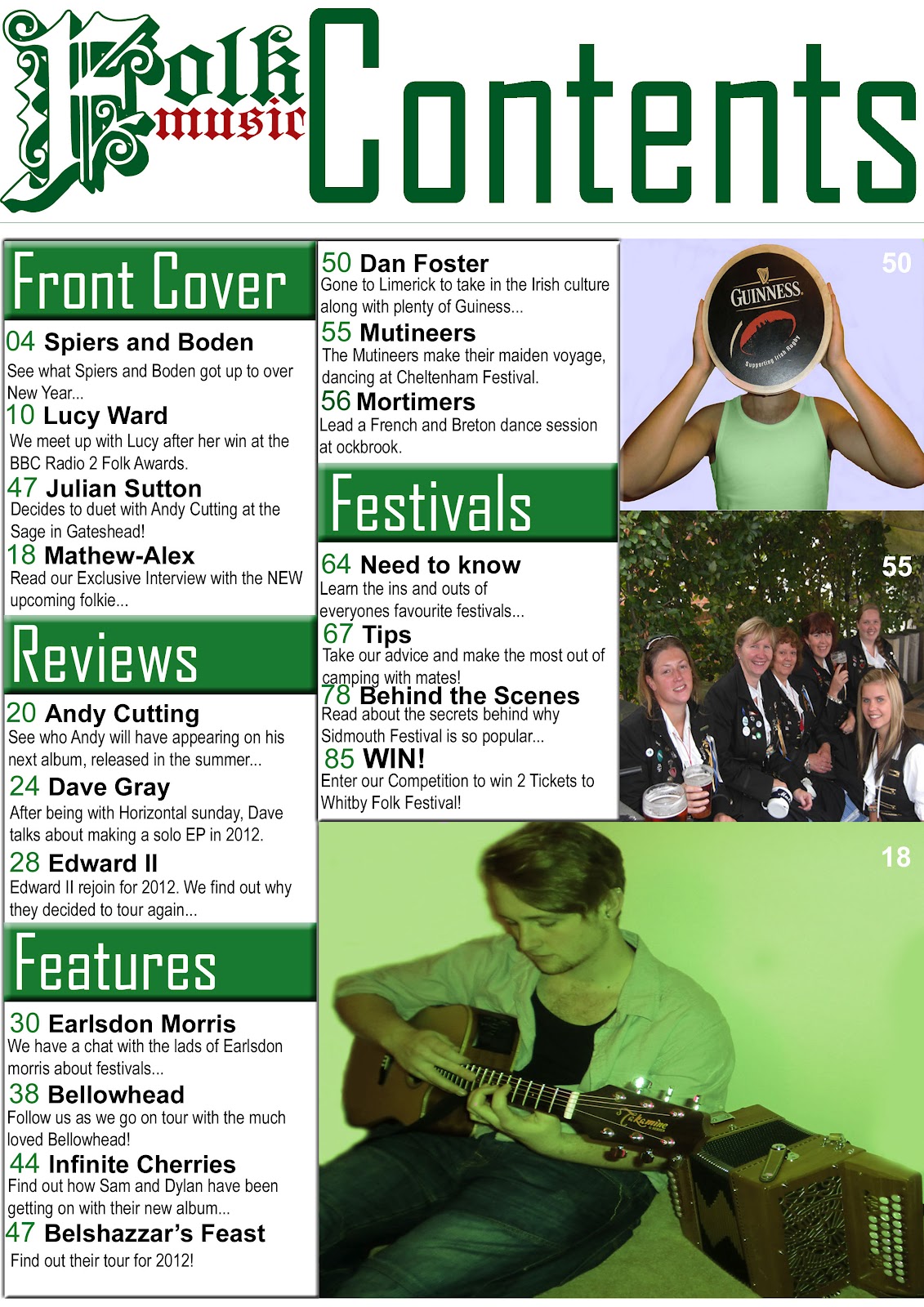
My contents page represents my social group mainly because of the colour scheme I have used and the props in the photos. The writting is simple and to the point and the photos still focus on the music aspect with the instruments on show linking to the folk genre and the morris dancers in the middle photo. A couple of the dancers may be slightly older than the age group I am aiming for but folk people look past the age and just see them as performers or musicians. Again i've kept with the same colour scheme as on the front cover as green is the best way to promote a folk based magazine.


My double page spread definitely represents a folk social group I think mainly because of the colours and photo used. I think that because the artist would actually fit into the target audience, he represents the social group perfectly. I wanted to keep the interview very informal and relaxed in the way that the representative social group would act and speak so that they could relate to it a lot easier.
Monday 12 March 2012
Evaluation Question 1 practice...
In what ways does your media product use, develop or challenge forms and conventions of real media products? (i.e of music magazines)


Looking at my magazine compared to a real one really let's you see how similar they actually are and it also helps to pick out the differences. First thing to look at would be the masthead. On the real 'Rolling Stone' magazine the masthead clearly goes across the top of the page which is the most common way to do a masthead as it makes it the most important piece of information on the page. It is layered over the image and has got a 3D font and is in a musty yellow colour which doesn't really represent what the magazine is most probably about. However as you see my masthead challenges the norm of having it across the top page. Instead I chose to have it just half way as I wanted to have the main focus to be on the name of the artist. I tried to pick a font that would also represent folk or atleast give of the right vibe so that is why I chose quite an old english style to give off the right effect.


The graphology of the contents page is the main aspect I worked on most to follow the conventions of other contents pages of music magazines I have seen during my research. Looking at both contents pages shows how similar they are. Mine uses a similar sort of layout at the real magazine contents page. My magazine clearly shows an 'F model' with the column on the left hand side and the column in the middle. Similarly the 'Rolling Stone' magazine uses a similar layout with the column down the left hand side and with a piece of writing across the bottom. Both magazines have the name of the magazine shown to let you know it's all part of the same one. I used the masthead whereas the other shortened it to 'RS.'
To represent the genre of my magazine I tried to pick the right props and costume to portray the right image. As you can see on my front cover I have got my model in quite a creased shirt with just a plain black top underneath. The creased shirt, beard and chest hair gives off a rugged sort of folk festival look which is what I was aiming for. Also on the contents page I have got the same model sat on the floor with an acoustic guitar and a melodeon, both which are popular within the folk community so I thought they'd be good to use.
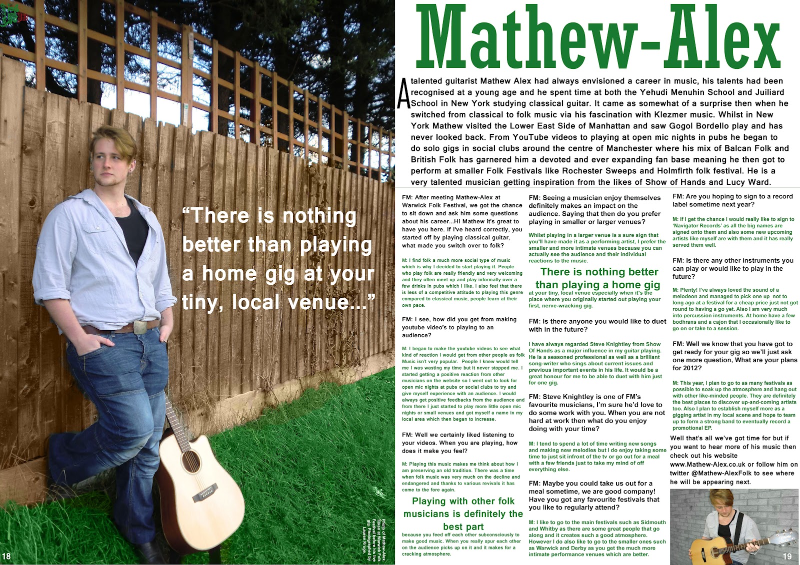
I tried to get a variety of different camera angles throughout my magazine. My front cover uses a mid-shot of my model which is the usual angle to use on a front cover as it wants to be eye-catching and be clear to see if it was on a shop shelf. My contents page uses a variety of mid shots and long shots which again is the usual thing to do on a contents page as you want to keep it looking interesting. As you can see above on my double page spread I use a long shot photo so that you can see the guitar clearly and get a good size patch of grass to get the greeness.
I tried to fit a variety of different fonts in my magazine to keep it looking interesting. On the front cover I used a very old style english font to represent folk and to fit with the genre. I used that font throughout but only on the name of the magazine on each of the pages. I then use another 2 different fonts on the front cover to keep it from looking boring. On the contents page I use a new font for the title and the little sub headings and then another font for the page information. Again on my contents page I use a new style font for the artists name and another for the article. I used a nice, clear font for the article to make it easy to rea
I used a variety of different techniques to make sure the folk genre was being shown throughout the magazine. For the masthead like i've said before I chose an old style font to fit with the stereotypical folk look. For the front cover photo I had my model looking quite rugged to give off the festival style and to fit in with the typical folk lad. On the contents page I used a collection of photo's to fit with the folk genre and show it off. I have a model holding up a Guiness Bodhran over their face, as picture of a morris dancing team and then my front cover model with an acoustic guitar and a melodeon. All photo's connect well with the genre of folk as they all play a big part in it. Finally on my DPS I have a long shot photo of my model with his guitar in a field which is supposed to represent being at a festival or maybe just a photoshoot for an album cover. The colour scheme I chosen also I think fits very well with the representation of Folk. Throughout the magazine I used a range of greens, white and black. Green is the main colour focus I wanted to have throughout the magazine as most people stereotypically put the colour green and folk together.


Monday 27 February 2012
Improvements needed...
-Original model needed for cover photo.
-Different angles of photos needed.
-Different setting for photo's.
-Different texts needed for front cover and DPS.
-Different colours needed for DPS on article.
-Gaps between Q and A and the pararaph at the top needs to be bigger.
-Different angles of photos needed.
-Different setting for photo's.
-Different texts needed for front cover and DPS.
-Different colours needed for DPS on article.
-Gaps between Q and A and the pararaph at the top needs to be bigger.
Mr Nicolle feedback summary...
No surprises as you already know it's your pictures that need more work. Consider the setting, mise-en-scene more carefully as well as cutting and cropping. Also editing to achieve your desired effect.
Front cover- too much white space on the background. Most of font is the same size. Check against research.
Low level 2.
Front cover- too much white space on the background. Most of font is the same size. Check against research.
Low level 2.
Sunday 26 February 2012
Wednesday 22 February 2012


Front Cover Draft...

Monday 6 February 2012
Artist Profile...

Name: Mathew-Alex
Age: 19
From: Manchester
A talented guitarist Matthew-Alex had always envisioned a career in music, his talents had been recognised at a young age and he spent time at both the Yehudi Menuhin School and Juiliard School in New York studying classical guitar. It came as somewhat of a surprise then when he switched from classical to folk music via his fascination with Klezmer music. Whilst in New York Mathew visited the Lower East Side of Manhattan and saw Gogol Bordello play and has never looked back. From YouTube videos to playing at open mic nights in pubs he began to do solo gigs in social clubs around the centre of Manchester where his mix of Balcan Folk and British Folk has garnered him a devoted and ever expanding fan base meaning he then got to perform at smaller Folk Festivals like Rochester Sweeps and Holmfirth folk festival. He is a very talented musician getting inspiration from the likes of Show of Hands, Lucy Ward and Ahab. In his spare time he enjoys composing and writing his own material and spending time with his family.
Friday 3 February 2012
Interview Q & A - Draft Article so far...
'If I've heard correctly, you started off by playing classical guitar, what made you switch over to folk?
I find folk a much more social type of music which is why I decided to start playing it. People who play folk are really friendly and very welcoming and they often meet up and play informally over a few drinks in pubs which I like. I also feel that there is less of a competitive attitude to playing this genre compared to classical music, people learn at their own pace.
'When you are playing, how does it make you feel?'
Playing this music makes me think about how I am preserving an old tradition. There was a time when folk music was very much on the decline and endangered and thanks to various revivals it has come to the fore again. Playing with other folk musicians is definitely the best part of it because you feed off each other subconsciously to make good music. When you really spur each other on the audience picks up on it and it makes for a cracking atmosphere.
' Do you prefer playing in smaller or larger venues?'
Whilst playing in a larger venue is a sure sign that you'll have made it as a performing artist, I prefer the smaller and more intimate venues because you can actually see the audience and their individual reactions to the music. There is nothing better than playing a home gig at your tiny, local venue especially when it's the place where you originally started out playing your first, nerve-wracking gig.
'Is there anyone you would like to duet with in the future?'
I have always regarded Steve Knightley from Show Of Hands as a major influence in my guitar playing. He is a seasoned professional as well as a brilliant song-writer who sings about current issues and previous important events in his life. It would be a great honour for me to be able to duet with him just for one gig.
'Any plans for 2012?'
This year, I plan to go to as many festivals as possible to soak up the atmosphere and hang out with other like-minded people. They are definitely the best places to discover up-and-coming artists too. Also I plan to establish myself more as a gigging artist in my local scene and hope to team up to form a strong band to eventually record a promotional EP.
1st Draft Magazine Mock up...

Thursday 2 February 2012
Test Shots so far...
Here are some of the tests shots I have so far. Some I like for either the front page or the double page spread. I've got a few different settings as I was wanting to see which one I thought would look the best. There are a couple of myself as we were trying to see if it would look any different having me hold the melodoen rather than my other model. I am happy with a few but would like to go out and get more to improve.
Wednesday 1 February 2012
Colour Texts on Background...
Black on white is still the easiest way to present type and to read it and you change that colour at your peril. Using coloured paper, coloured type or a heavy type patch often reduces legibility. In tests carried out by Karl Borgrgrafe (cited in Favre and November 1979) to see which colours worked best together, the following taxonomy of colour mixes was discovered, starting with the most legible, and working through to the least legible.
Black on yellow
Yellow on black
Green on white
Red on white
Black on white
White on blue
Blue on yellow
Blue on white
White on black
Green on yellow
Black on orange
Red on yellow
Orange on black
Yellow on blue
White on green
Black on red
Blue on orange
Yellow on green
Blue on red
Yellow on red
White on red
Red on black
White on orange
Black on green
Orange on white
Orange on blue
Yellow on orange
Red on orange
Red on green
Green on orange
As you can see, black and white comes pretty near the top although the list suggests that a yellow panel behind the black type would improve legibility (which is why important warning signs of danger are usually printed black on yellow.)
From: Designing for Newspapers and Magazines, by Chris Frost, Routledge, 2003
Note: though black on yellow may be more striking than black on white, it is unlikely to be more pleasing in large quantities. Magazine designers have to strike a balance between legibility, impact, and reader satisfaction.
Between getting attention, and not being annoying. CE
Sunday 29 January 2012
Monday 23 January 2012
Sunday 22 January 2012
Contents Page Analysis...

This magazine uses the F model for the layout. Down the left hand side they have got the latest music chart. Pictures under the contents title illustrating what information will be inside. The colours are very simple just blue, black and white. They work well together and give off a good feel about the magazine.

This Q magazine uses the F model for its layout. It has the contents banner across the top with writing down the left hand side and over the picture. It uses the same colours as the cover does : Red, White and black. Having the picture on the right hand side is good to see who the main feature is in the magazine and it also is a good way of breaking up all the writing.

This contents page uses the Z model. The 'Contents' title is in yellow on a black background which is effective as the colour stands out, they've also used it for the little sub-headings. The pictures on the page illustrate what information is in the magazine. One picture is bigger than the rest giving you the impression that that is going to be the main feature of the magazine.
Saturday 21 January 2012

Colour Palettes...
Here's a few colour palettes for me to start getting ideas of what I will want to use...


Genre of Music for Magazine...
If you read the 'About me' part of my blog, you will read about how I am very much into Folk music. It's been a part of my life ever since I was little and from playing the melodeon it has become more of an importance to me. This is why I am wanting to go down a different route to most students and do a Folk magazine. Not Folk as in old men with beards sat around in a pub playing music, (although that is a big part of what I do) I want to use the more modern Folk Bands and appeal to my generation of Folkies. Here are a few bands that I enjoy listening to. These may also help me get ideas for the style of pictures I will want to use in my magazine...


I really like the band pictures of Ahab. They are just wearing their own casual clothes with their instruments. I like the idea of the photos being taken of them performing, that way they're not false. Also i like the look of the black and white photos that have been put together. You can see instruments sat behind them and its quite untidy looking but fits together really well. Seems like a relaxed atmosphere for them.
Luke Jackson...


This is a young artist called Luke Jackson, I have seen him at a few folk events and found these pictures online of him. I'm not necessarily using him for the style of music, more for the photos that he has. I really like the bottom photo of him performing with his guitar, I like the positioning of him and the surroundings he is in. I would like to re-create something similar to the one with the red door, I like that burst of colour and how he is standing with his guitar. The close up of him looking down on his guitar i find very effective aswell as we are looking down the neck of the guitar and he looks like he is in a zone of concentration. I would like similar pictures in my magazine.
Show of Hands...

Show of Hands are an older band but still liked by the younger Folk generation. I really like the picture that I found of these. The setting of the warehouse/underground pub adds real effect especially with the tone of the picture aswell.
Spiers and boden...

Finally Spiers and boden, the video shows them playing at the Royal Albert Hall with their 11 piece band called 'Bellowhead' who are very big in the Folk world. Jon Spiers the melodeon player has inspired so much when it comes to playing traditional english tunes. I like the picture as it is plain and simple, you get the idea of what it is straight the way. They haven't tried hard to find a good background, they just stuck with plain white with casual black shirts.
Thursday 19 January 2012
My Music Taste...
My music taste is very varied. I like to listen to pretty much any genre to a certain extent. Here are just a few of the artists I enjoy to listen to...

I love listening to Ed Sheeran's music. I like the fact that he doesn't try to hard or to be like anyone, it's his own style with just him and his guitar. He has some lovely lyrics in his songs and has a great voice.

Chris Daughtry was a finalist on Season 5 of American Idol. He created this band and began to release singles and albums. I love his style, he'll have some real rock songs but then also do some soft rock songs. His lyrics always have a good meaning and he has a really unique sounding voice. There hasnt been one song of his that I haven't liked.

GreenDay are a band that I have grown up with and have always loved their music. I went to see them the other year with my dad and they are the best live band I have seen, you would of thought you were listening to the CD. All their songs are incredible with good guitar/bass riffs and one of the best drum players i've seen. Their songs never fail to impress me.
Subscribe to:
Posts (Atom)