Who would be the audience for your media product?
I am trying to aim my magazine at the younger folk generation. Ages from about 18-30. 95% of the time they would be musicians or somehow involved in the folk scene by morris dancing. They would enjoy attending festivals such as Whitby and Sidmouth and spend time in sessions and at ceilidhs. They 'd be very sociable as meeting new people plays a big part in Folk.
They would have all the usual big folk artists on their ipod such as Bellowhead, Show of Hands, Peatbog Faeries and Spiers and Boden. In their spare time they enjoy seeing mates, practicing instruments/dancing or being down the pub in a session.
They don't necessarily have their own fashion sense, just the usual highstreet clothes.
Monday, 19 March 2012

Thursday, 15 March 2012
Evaluation Question 3 Practice...
What kind of media institution might distribute your media product and why?
I think the best media institution best suited to distribute my magazine would be Proper Music Distribution. This company publishes other folk magazine such as Froots and Maverick however these tend to have an appearance and contents designed for an older audience. As I am aiming at the younger folk generation there is definitely a gap in the market for my magazine. People would be able to subscribe online and buy in selected shops. I could also look into publishing it online for download as this would suit the age group i'm aiming at a lot more as they are more up to date with technology. Out of the possibilities of circulation I would more than likely choose paid circulation as this is what Froots seem to do. This way it will be easily accessible and available for subscriptions. I would only choose to put it in certain shops in the citys I choose as not everywhere has a big folk scene. Places like Newcastle, Sheffield and York would be ideal with a few others dotted about. As most magazines I would publish it weekly at a fixed price with the cheaper option for the reader of subscribing for a longer period of time.
I think the best media institution best suited to distribute my magazine would be Proper Music Distribution. This company publishes other folk magazine such as Froots and Maverick however these tend to have an appearance and contents designed for an older audience. As I am aiming at the younger folk generation there is definitely a gap in the market for my magazine. People would be able to subscribe online and buy in selected shops. I could also look into publishing it online for download as this would suit the age group i'm aiming at a lot more as they are more up to date with technology. Out of the possibilities of circulation I would more than likely choose paid circulation as this is what Froots seem to do. This way it will be easily accessible and available for subscriptions. I would only choose to put it in certain shops in the citys I choose as not everywhere has a big folk scene. Places like Newcastle, Sheffield and York would be ideal with a few others dotted about. As most magazines I would publish it weekly at a fixed price with the cheaper option for the reader of subscribing for a longer period of time.
Tuesday, 13 March 2012
Evaluation Question 2...
How does your media product represent a particular social group?


The social group that I am hoping to aim my magazine at are generally known as 'Folkies.' I have designed my magazine in the way that I think would attract this certain group. The style of my magazine is similar to magazines such as RollingStone and Spex. They aren't necessarily the same genre as my magazine but they both use similar photos and the same sort of layout. The colours I used on my front cover and throughout my magazine represent the genre well as most people associate folk with the colour green. I chose my cover artist as I think he has the 'Folk look' about him. He's not clean shaven with nice gelled hair and smart clothes. Instead he's got facial hair, fairly messed up hair and a creased shirt on which I think reflects the genre well. Also I chose the photo where he isn't looking at the camara which is usually a good technique to use as it draws the reader in however folk music isnt about drawing people in, they don't go out of their way to get noticed, it is all very laid back. Folk artists mainly just play the music they enjoy and hope that others will enjoy it with them. They don't choose to go out of their comfort zone to get more followers.
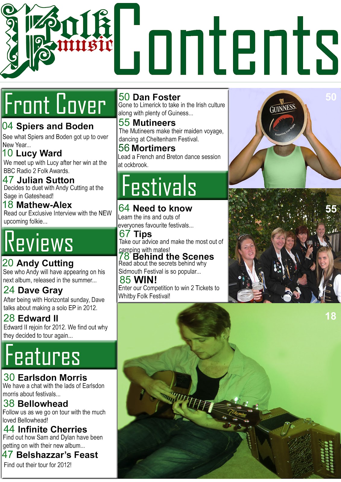
My contents page represents my social group mainly because of the colour scheme I have used and the props in the photos. The writting is simple and to the point and the photos still focus on the music aspect with the instruments on show linking to the folk genre and the morris dancers in the middle photo. A couple of the dancers may be slightly older than the age group I am aiming for but folk people look past the age and just see them as performers or musicians. Again i've kept with the same colour scheme as on the front cover as green is the best way to promote a folk based magazine.


My double page spread definitely represents a folk social group I think mainly because of the colours and photo used. I think that because the artist would actually fit into the target audience, he represents the social group perfectly. I wanted to keep the interview very informal and relaxed in the way that the representative social group would act and speak so that they could relate to it a lot easier.
Monday, 12 March 2012
Evaluation Question 1 practice...
In what ways does your media product use, develop or challenge forms and conventions of real media products? (i.e of music magazines)


Looking at my magazine compared to a real one really let's you see how similar they actually are and it also helps to pick out the differences. First thing to look at would be the masthead. On the real 'Rolling Stone' magazine the masthead clearly goes across the top of the page which is the most common way to do a masthead as it makes it the most important piece of information on the page. It is layered over the image and has got a 3D font and is in a musty yellow colour which doesn't really represent what the magazine is most probably about. However as you see my masthead challenges the norm of having it across the top page. Instead I chose to have it just half way as I wanted to have the main focus to be on the name of the artist. I tried to pick a font that would also represent folk or atleast give of the right vibe so that is why I chose quite an old english style to give off the right effect.


The graphology of the contents page is the main aspect I worked on most to follow the conventions of other contents pages of music magazines I have seen during my research. Looking at both contents pages shows how similar they are. Mine uses a similar sort of layout at the real magazine contents page. My magazine clearly shows an 'F model' with the column on the left hand side and the column in the middle. Similarly the 'Rolling Stone' magazine uses a similar layout with the column down the left hand side and with a piece of writing across the bottom. Both magazines have the name of the magazine shown to let you know it's all part of the same one. I used the masthead whereas the other shortened it to 'RS.'
To represent the genre of my magazine I tried to pick the right props and costume to portray the right image. As you can see on my front cover I have got my model in quite a creased shirt with just a plain black top underneath. The creased shirt, beard and chest hair gives off a rugged sort of folk festival look which is what I was aiming for. Also on the contents page I have got the same model sat on the floor with an acoustic guitar and a melodeon, both which are popular within the folk community so I thought they'd be good to use.
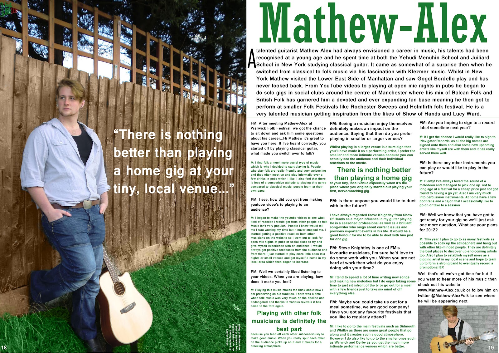
I tried to get a variety of different camera angles throughout my magazine. My front cover uses a mid-shot of my model which is the usual angle to use on a front cover as it wants to be eye-catching and be clear to see if it was on a shop shelf. My contents page uses a variety of mid shots and long shots which again is the usual thing to do on a contents page as you want to keep it looking interesting. As you can see above on my double page spread I use a long shot photo so that you can see the guitar clearly and get a good size patch of grass to get the greeness.
I tried to fit a variety of different fonts in my magazine to keep it looking interesting. On the front cover I used a very old style english font to represent folk and to fit with the genre. I used that font throughout but only on the name of the magazine on each of the pages. I then use another 2 different fonts on the front cover to keep it from looking boring. On the contents page I use a new font for the title and the little sub headings and then another font for the page information. Again on my contents page I use a new style font for the artists name and another for the article. I used a nice, clear font for the article to make it easy to rea
I used a variety of different techniques to make sure the folk genre was being shown throughout the magazine. For the masthead like i've said before I chose an old style font to fit with the stereotypical folk look. For the front cover photo I had my model looking quite rugged to give off the festival style and to fit in with the typical folk lad. On the contents page I used a collection of photo's to fit with the folk genre and show it off. I have a model holding up a Guiness Bodhran over their face, as picture of a morris dancing team and then my front cover model with an acoustic guitar and a melodeon. All photo's connect well with the genre of folk as they all play a big part in it. Finally on my DPS I have a long shot photo of my model with his guitar in a field which is supposed to represent being at a festival or maybe just a photoshoot for an album cover. The colour scheme I chosen also I think fits very well with the representation of Folk. Throughout the magazine I used a range of greens, white and black. Green is the main colour focus I wanted to have throughout the magazine as most people stereotypically put the colour green and folk together.


Monday, 27 February 2012
Improvements needed...
-Original model needed for cover photo.
-Different angles of photos needed.
-Different setting for photo's.
-Different texts needed for front cover and DPS.
-Different colours needed for DPS on article.
-Gaps between Q and A and the pararaph at the top needs to be bigger.
-Different angles of photos needed.
-Different setting for photo's.
-Different texts needed for front cover and DPS.
-Different colours needed for DPS on article.
-Gaps between Q and A and the pararaph at the top needs to be bigger.
Subscribe to:
Posts (Atom)